AI Newsletter Assistant
Improving conversions by 11% and boosting key business metrics through strategic redesign
B2C · AI · UX research · iterative design · product design
Project Overview
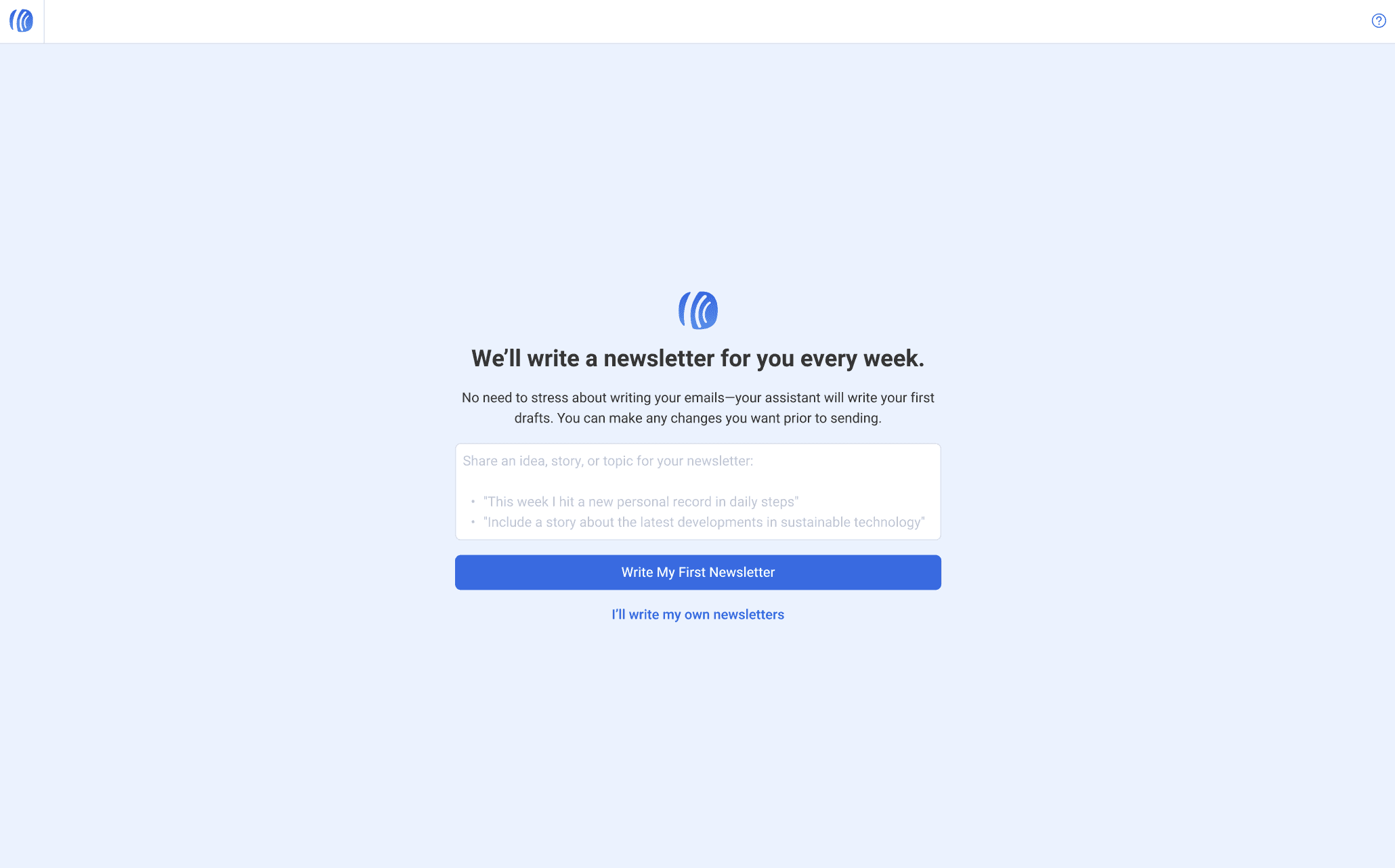
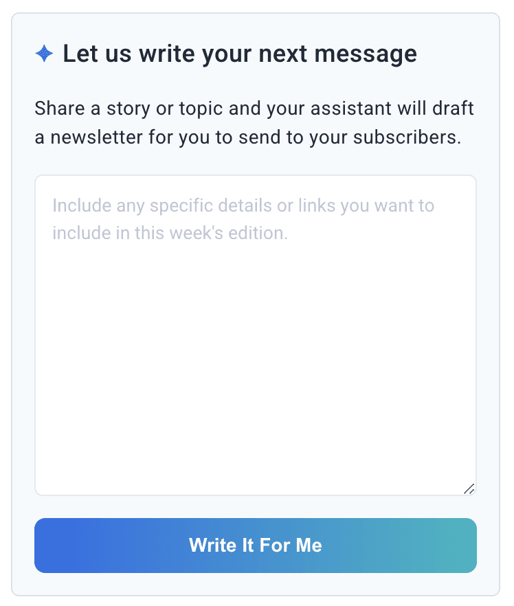
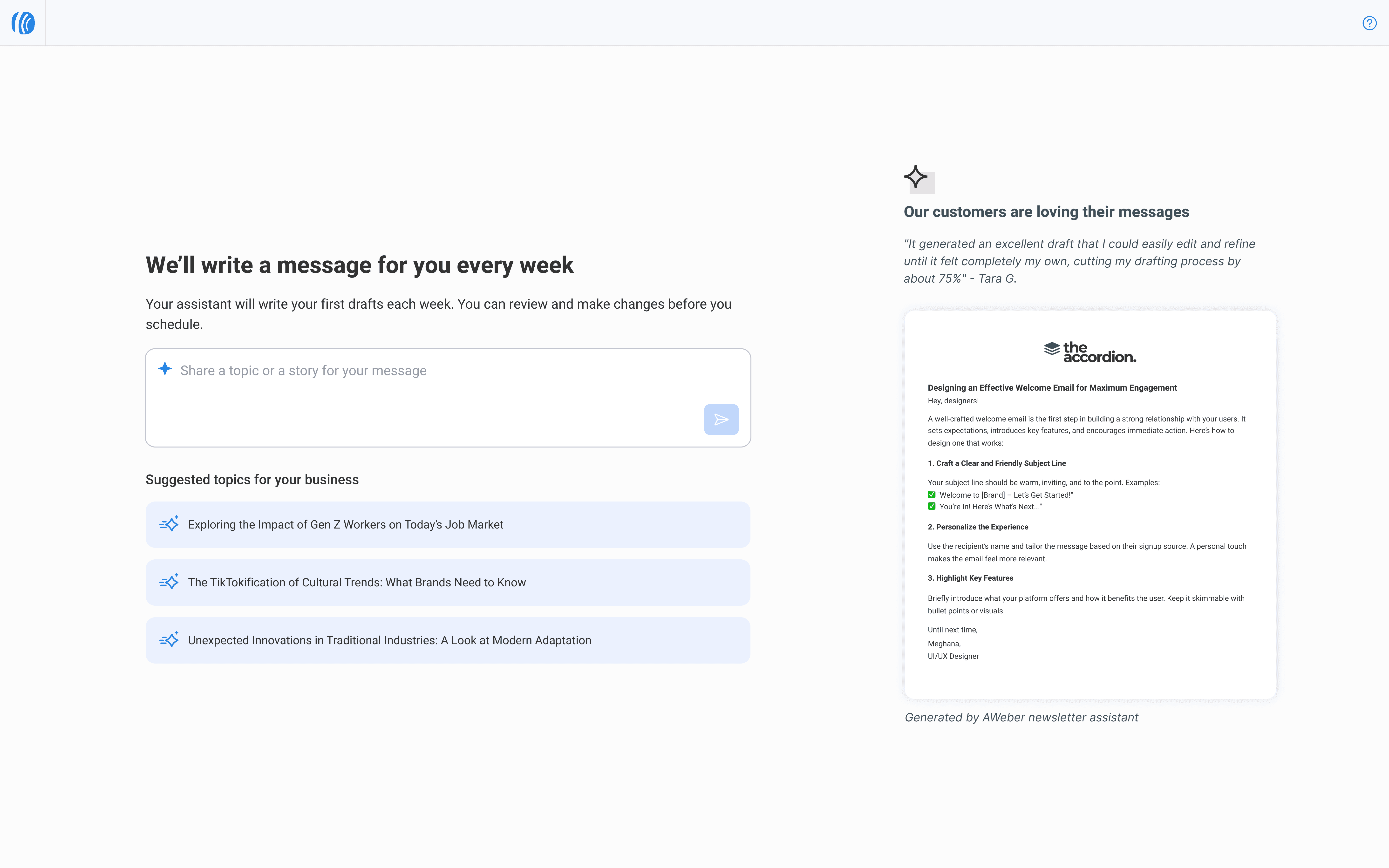
The AI newsletter assistant is an agent that generates messages based on user prompts and also suggests weekly topics with ready-to-schedule content, all within users' control.
The AI newsletter assistant is an agent that generates messages based on user prompts and also suggests weekly topics with ready-to-schedule content, all within users' control.
Problem
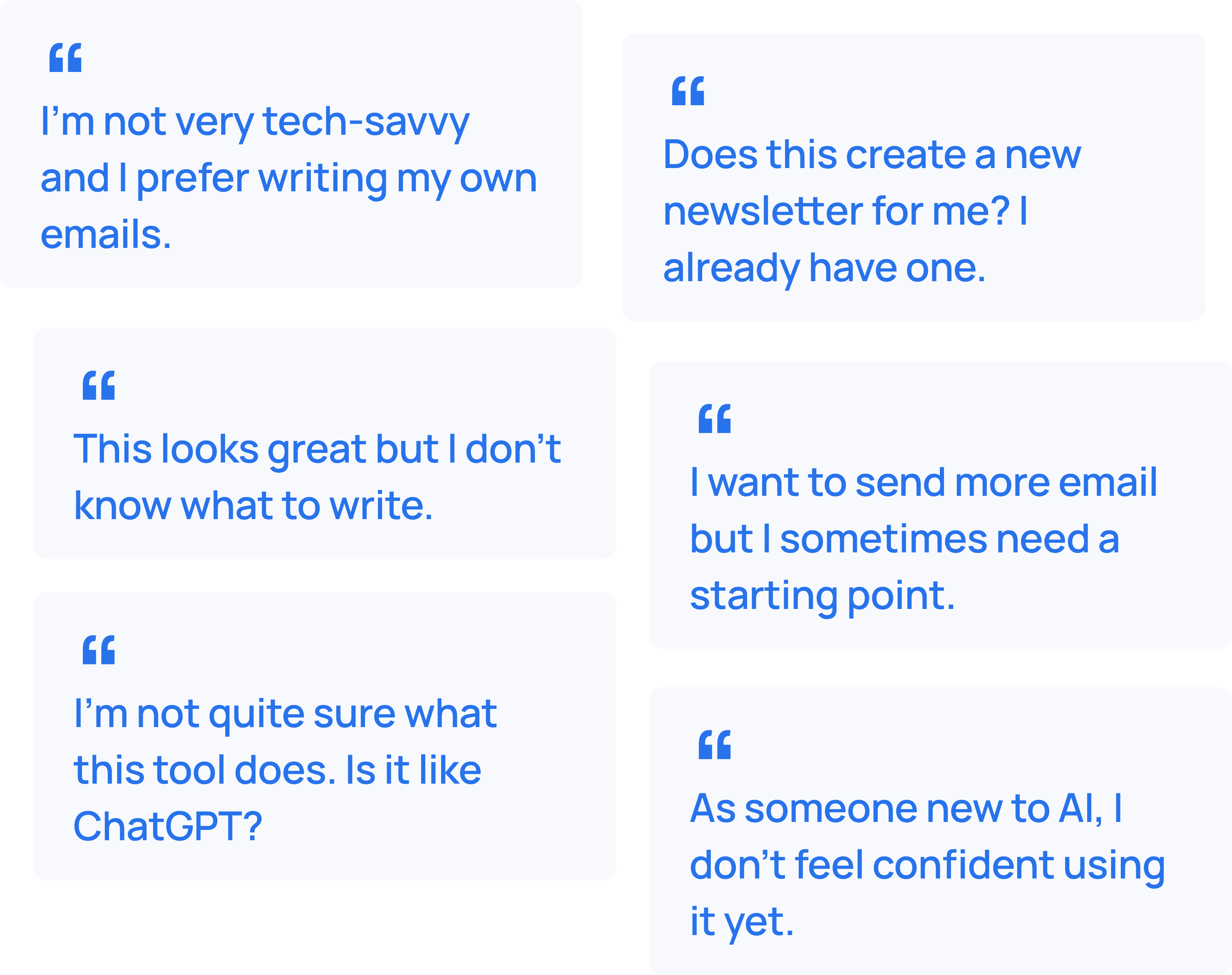
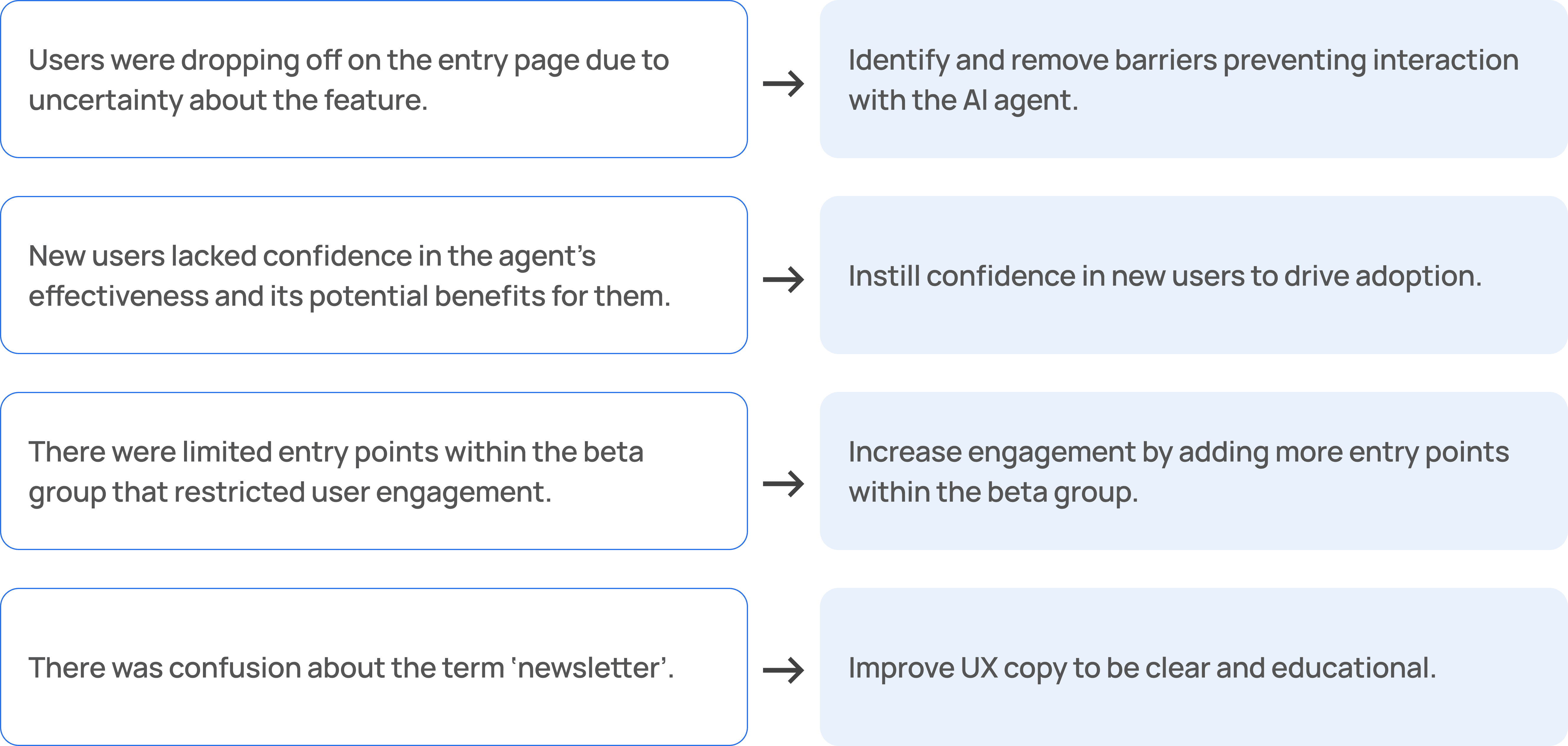
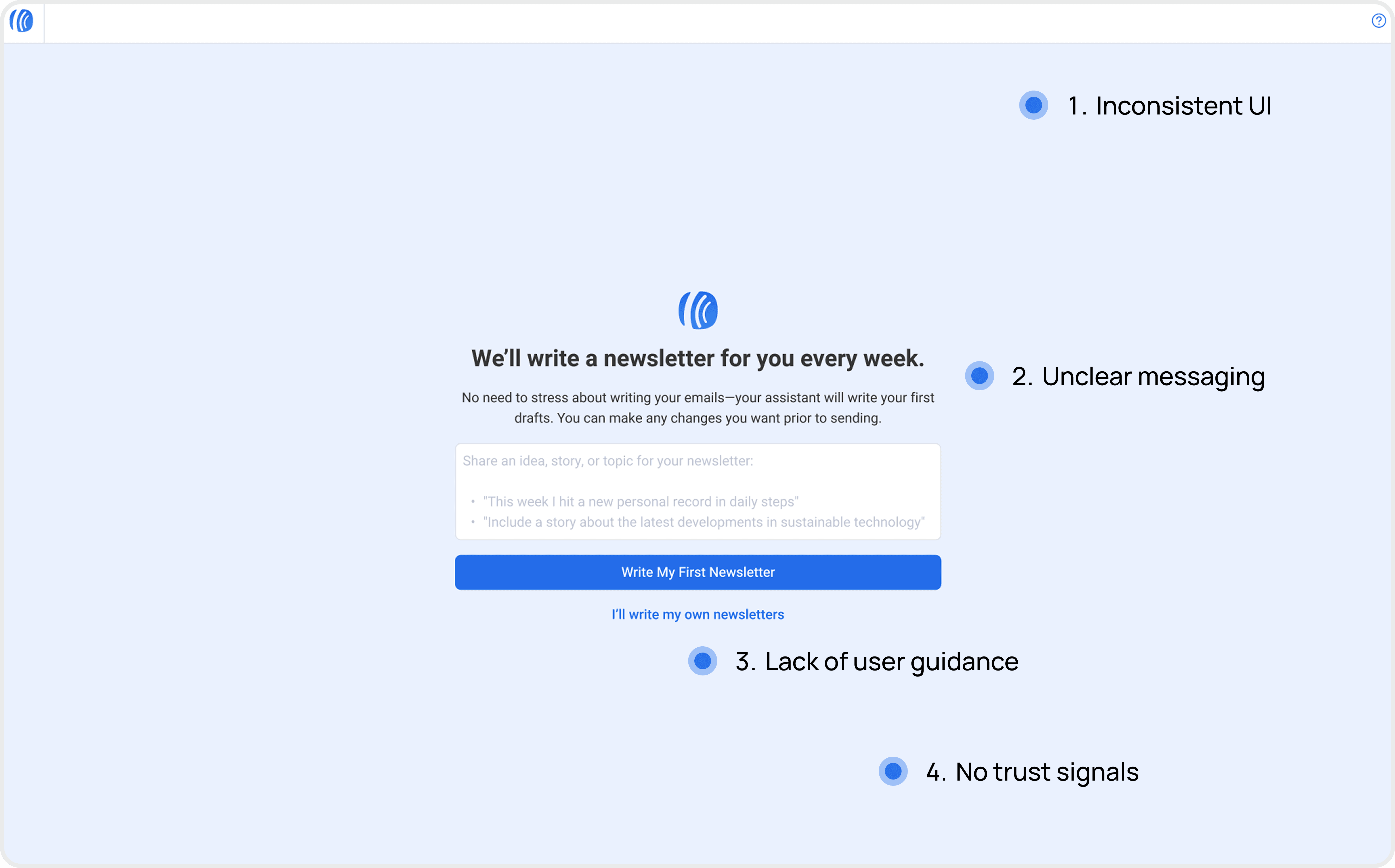
Problem
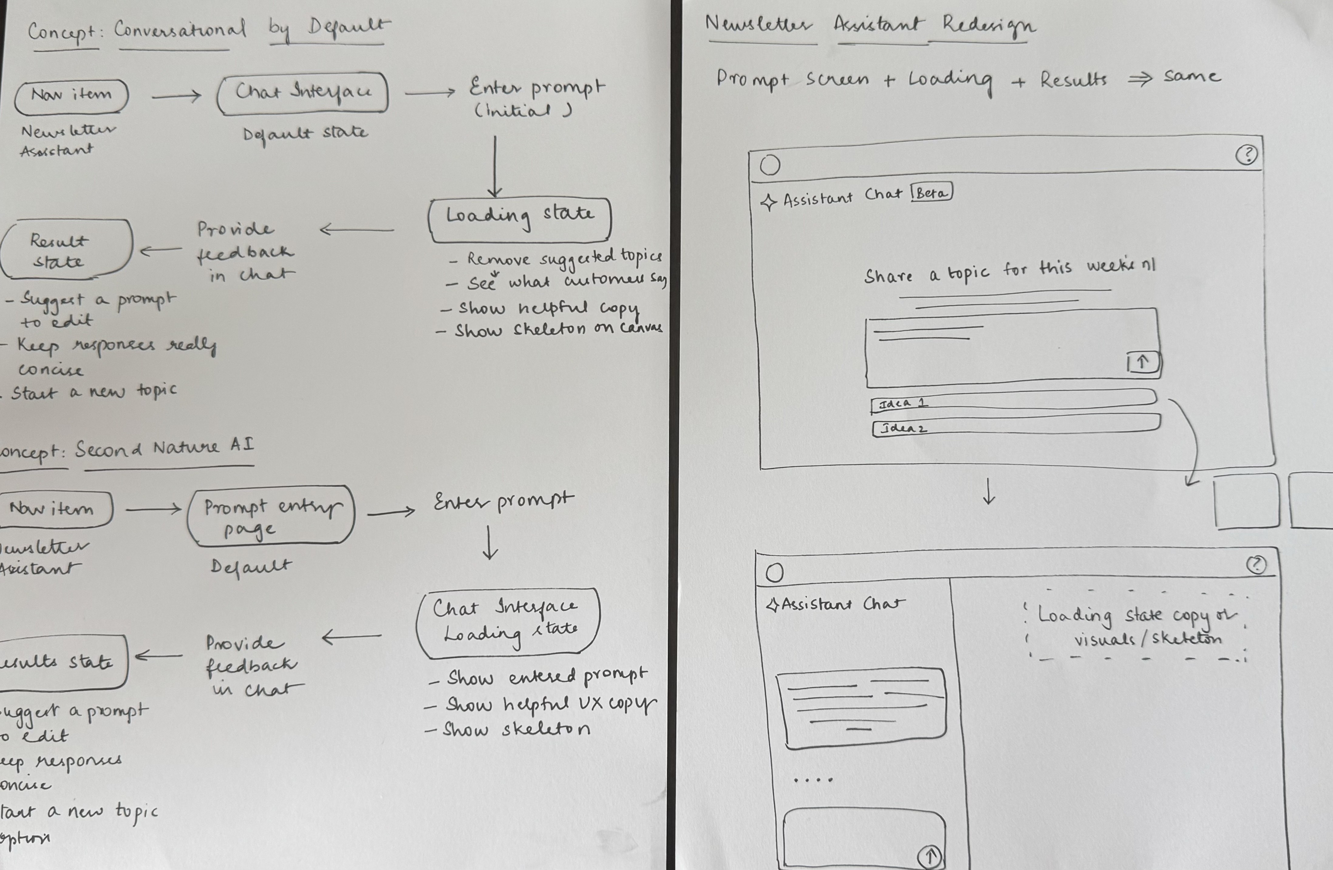
Users were dropping off on the entry page without engaging with the feature. By research and thorough analysis of user session data, I identified key pain points and redesigned the entry and loading experience, then implemented the changes myself.
Users were dropping off on the entry page without engaging with the feature. By research and thorough analysis of user session data, I identified key pain points and redesigned the entry and loading experience, then implemented the changes myself.
Contribution
UX research
UI/UX design
Front-end development
Contribution
UX research
UI/UX design
Front-end development
Impact
Impact
⬆️ 2,200
⬆️ 2,200
more feature page visits, up from 1,000
more feature page visits, up from 1,000
⬆️ 1,334
⬆️ 1,334
more users using the feature, up from 442.
more users using the feature, up from 442.
⬆️ 11%
⬆️ 11%
increase in conversion rate of users adding a prompt
increase in conversion rate of users adding a prompt
~ 5 hours
~ 5 hours
average user time saved through suggested topics
average user time saved through suggested topics